Busy Bus
Navigate the public transportation systems without the confusing schedules.
Problem
Have you ever missed a bus or train because of a confusing bus schedule? Many commuters have trouble quickly figuring out which bus is arriving next at the bus stop near them. This can get especially tricky if there are many routes using the same stop.
Solution
Busy Bus is an app that was created to make it easier to navigate the public transit system. For this project I focused on three screens; The map screen, a bus stop quick glance, and a bus stop full view.
Project Roles
- Brand creator
- Visual designer
- Frontend Developer
Deliverables
- User survey
- Competitive Analysis
- User stories
- Wireframes
- Digital mockups
- Example html & css
- Prototype and testing
Tools
- Figma
- Prott
- Google Forms
- Atom
- Github
The Process
User Research
User Survey
I conducted a survey to learn more about how people view and use public transit. All of the survey respondents have used public transit before. Most only use it rarely, while on vacation. 60% have been confused by the public transit schedules. Of those who have trouble with the schedules, some find the schedule hard to navigate, some are frustrated with the schedules not being up to date, and some say it was hard to find the schedule at all.
Competitive analysis
I researched the competition to gain an insight into the market. There are many public transit tracking apps out there due to the publicly available transportation data. Citymapper is a feature rich app that offers users a lot of transportation options but is limited in locations. Google Maps is a well established app that people already frequently use for navigation but they don’t offer a lot of public transit specific features.

User stories
After the research and discovery phase, I moved on to creating user stories in order to prioritize user tasks. I took the information from the survey and competitive analysis and used it to create a list of the most important features for the app. Here you can see some of the most important features.
| Role | Task | Importance |
|---|---|---|
| As a returning user | I would like to know which bus is arriving at a stop near me next | High |
| As a returning user | I would like to know how much time I have to get to a bus stop | High |
| As a returning user | I would like to view public transit routes | High |
| As a returning user | I would like to know where I am on the map relative to bus stops | High |
| As a returning user | I would like to see departure times | High |
Information Architecture
Wireframes
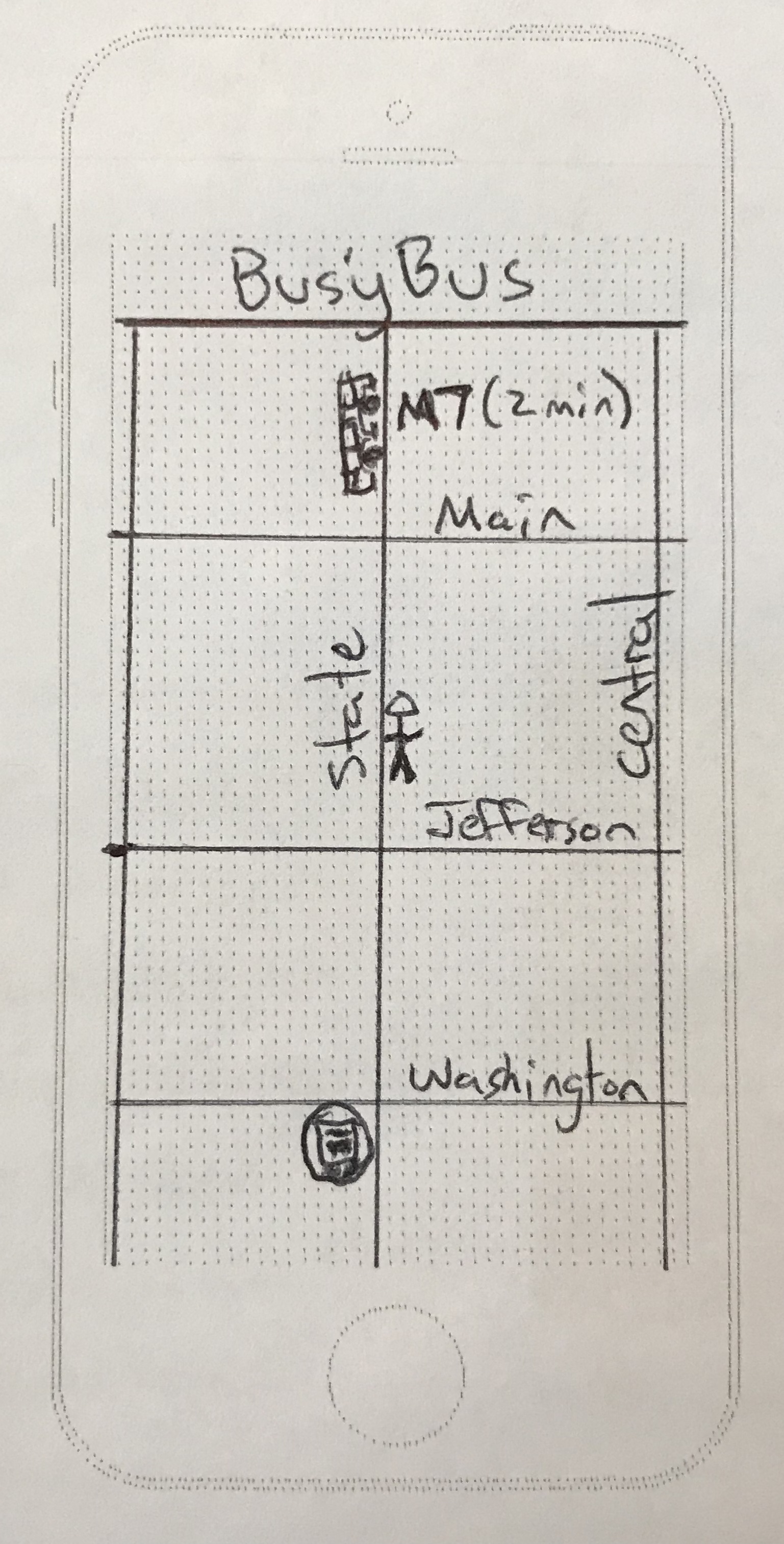
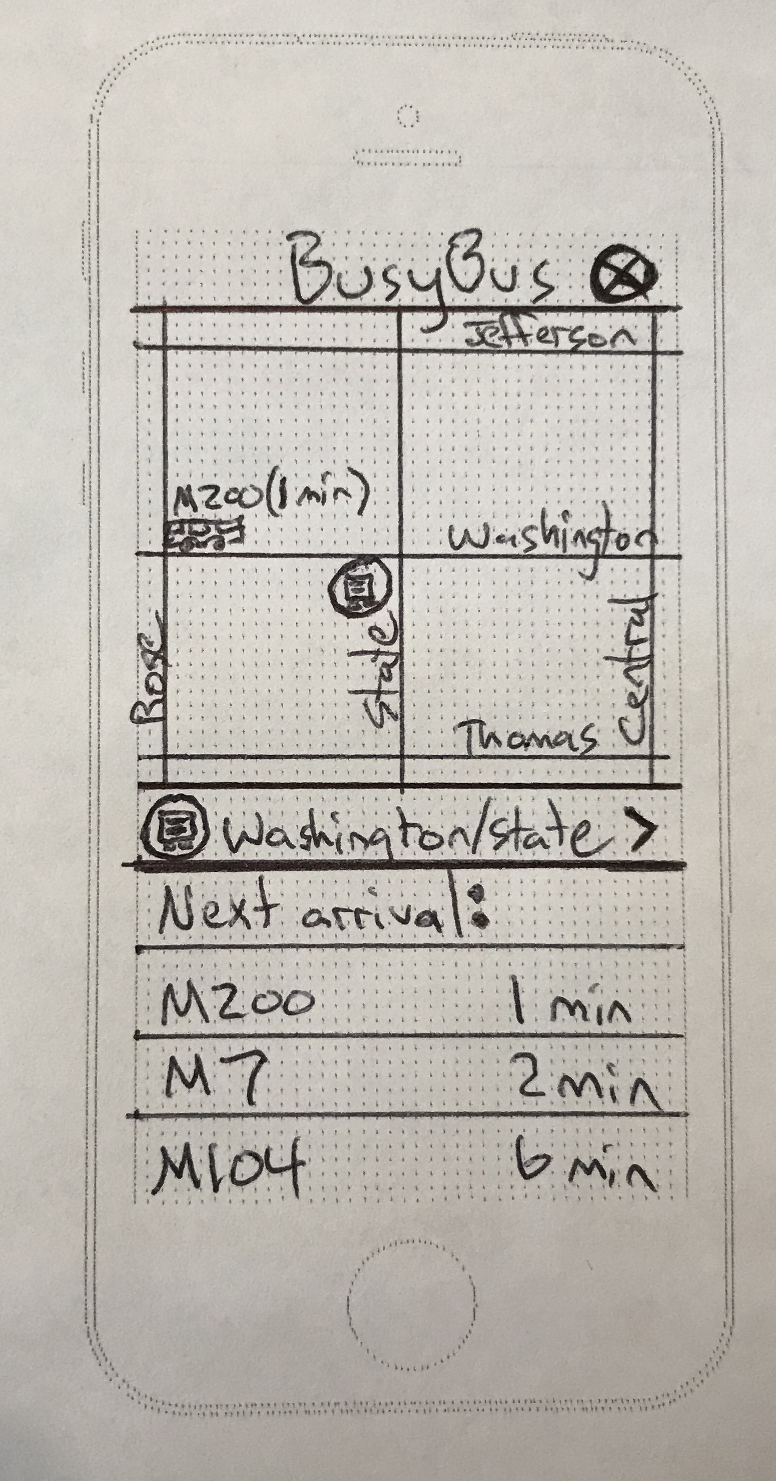
Once I had a list of the important features, I moved on to sketching what the app would actually look like. Since many people find public transportation schedules difficult to understand, I wanted to make the app as simple as possible.
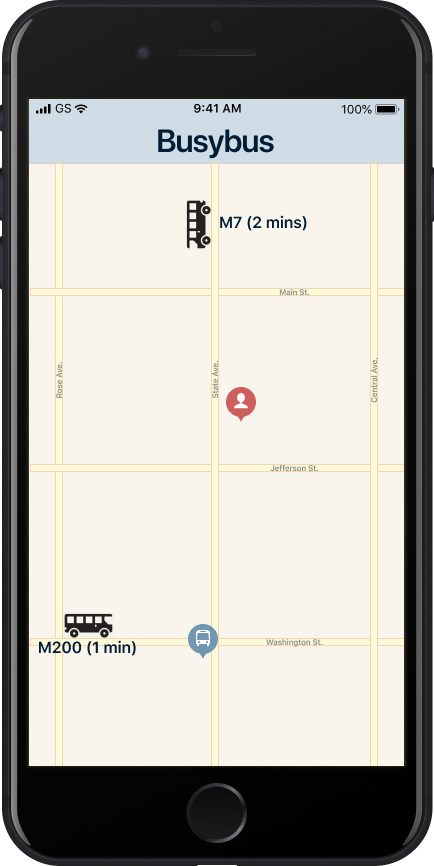
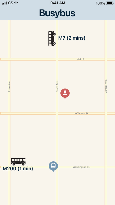
The first screen primarily consists of an interactive map that is centered on the user. The map shows the user’s location, nearby bus stops, and nearby buses.
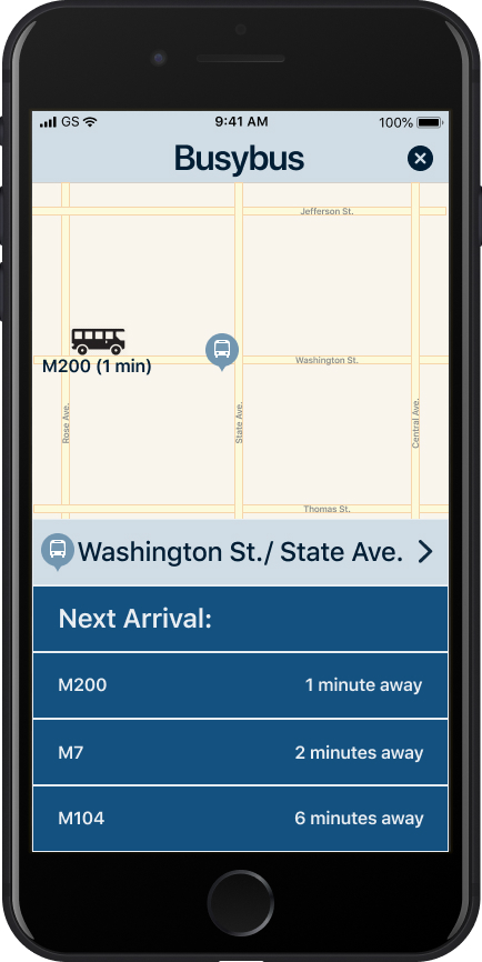
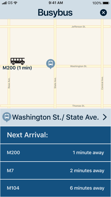
The user will be able to view more info about a bus stop by tapping on that bus stop. This will bring them to the next page of the app. Here the map will shrink and be centered on the bus stop. The bus stop name will be displayed under the map and the next three upcoming buses will show up under that. The user will now have the option to navigate back to the home screen via the navigation bar or to the next screen by tapping the bus stop name.
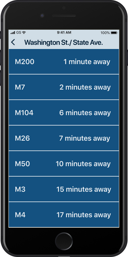
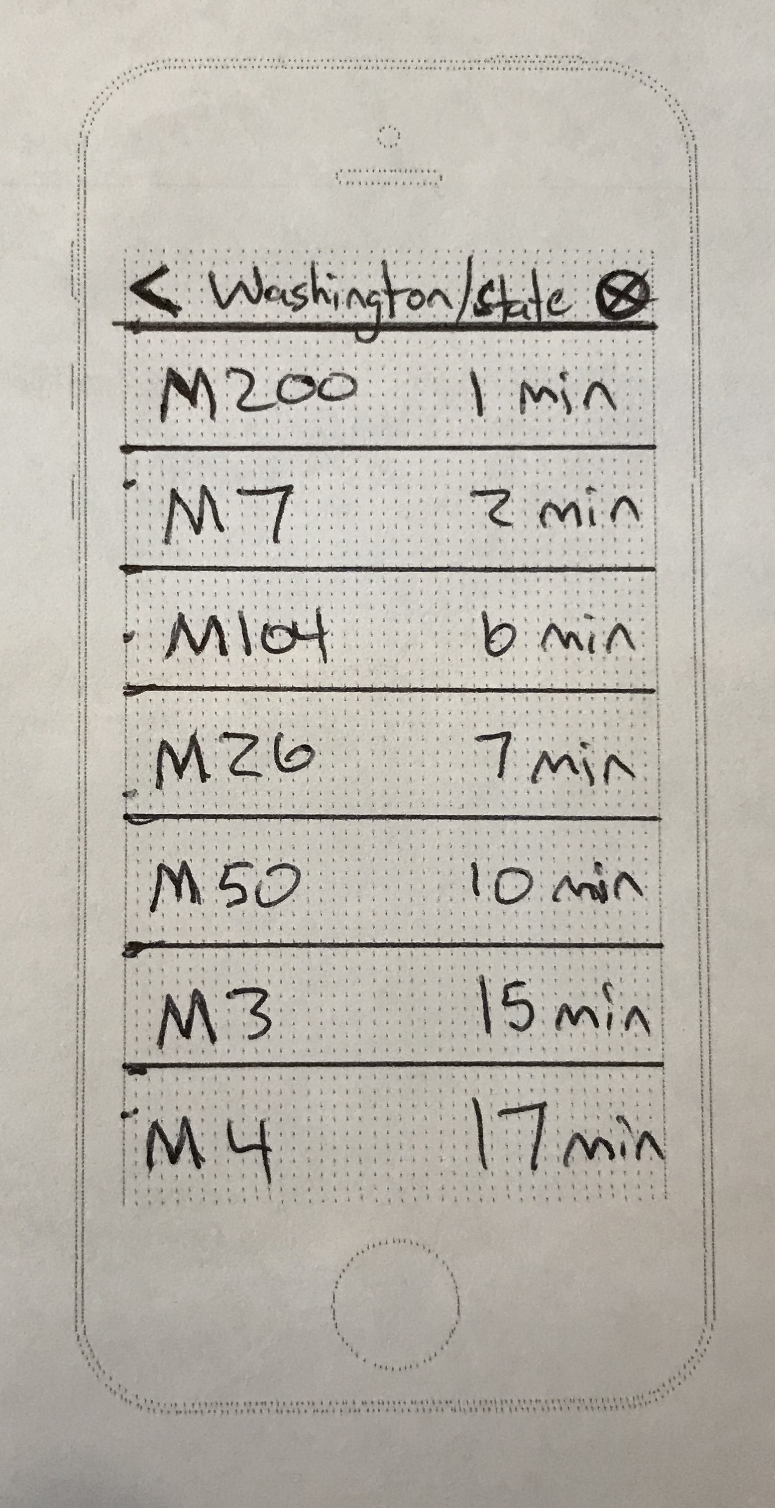
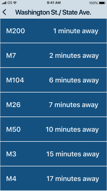
The last screen is showing all the bus routes that stop at the selected bus stop and their estimated arrival times.
Wireframes Sketches
Usability Testing
Using the Prott prototype app, I conducted some usability tests to see how people would interact with the BusyBus prototype. I asked questions like, “Where are you located on the map?”, “What buses stop at Washington and State?”, and “What is the next bus to arrive at Washington and State?”. It was really helpful to see how people interacted with the app. From the tests I learned that I need to make all of the icons clear and recognizable.
Visual Design
BusyBus style
Now that the basic design was done I moved to the style. I built this app for the Apple ecosystem so I decided to base the look of the map on Apple Maps. Otherwise the color scheme is a blueish-gray that I thought would stand out from the competition. (Google maps is white and black and rainbow and citymapper is green and white)
I chose SF Pro Display for the Titles and SF Pro Text for the smaller text. I went with these fonts to give the app a modern and familiar feel.
The user location icon is a standard profile icon that I made reddish-orange so it is easy to see. The bus stop icon is the front on bus while the nearby buses are side on bus icons.
Mockups
I took my sketches from earlier and turned them into digital mockups. I used the design choices from the last step and incorporated them here.
Mockups
Map Screen
Bus Stop Screen
Bus Routes Screen
Prototype
I built my digital mockups and prototype on Figma. I made the prototype based on the sketches and the user tests and added my visual design choices.
Development
The final step was to code a screen for app. Here you can see an example of the app built with html and css. This is the third screen of the app that shows all the bus routes that currently stop at the Washington and State bus stop.
Conclusion
This was a quick practice project that I used as a learning experience. I wanted to showcase this project as a sort of starting point for me.
A few lessons learned: I would have spent more time on the user surveys asking users questions that would have helped with the end product in mind. I didn’t think enough about the big picture. I tried solving the problem by looking at existing apps instead of focusing more directly on the problem.