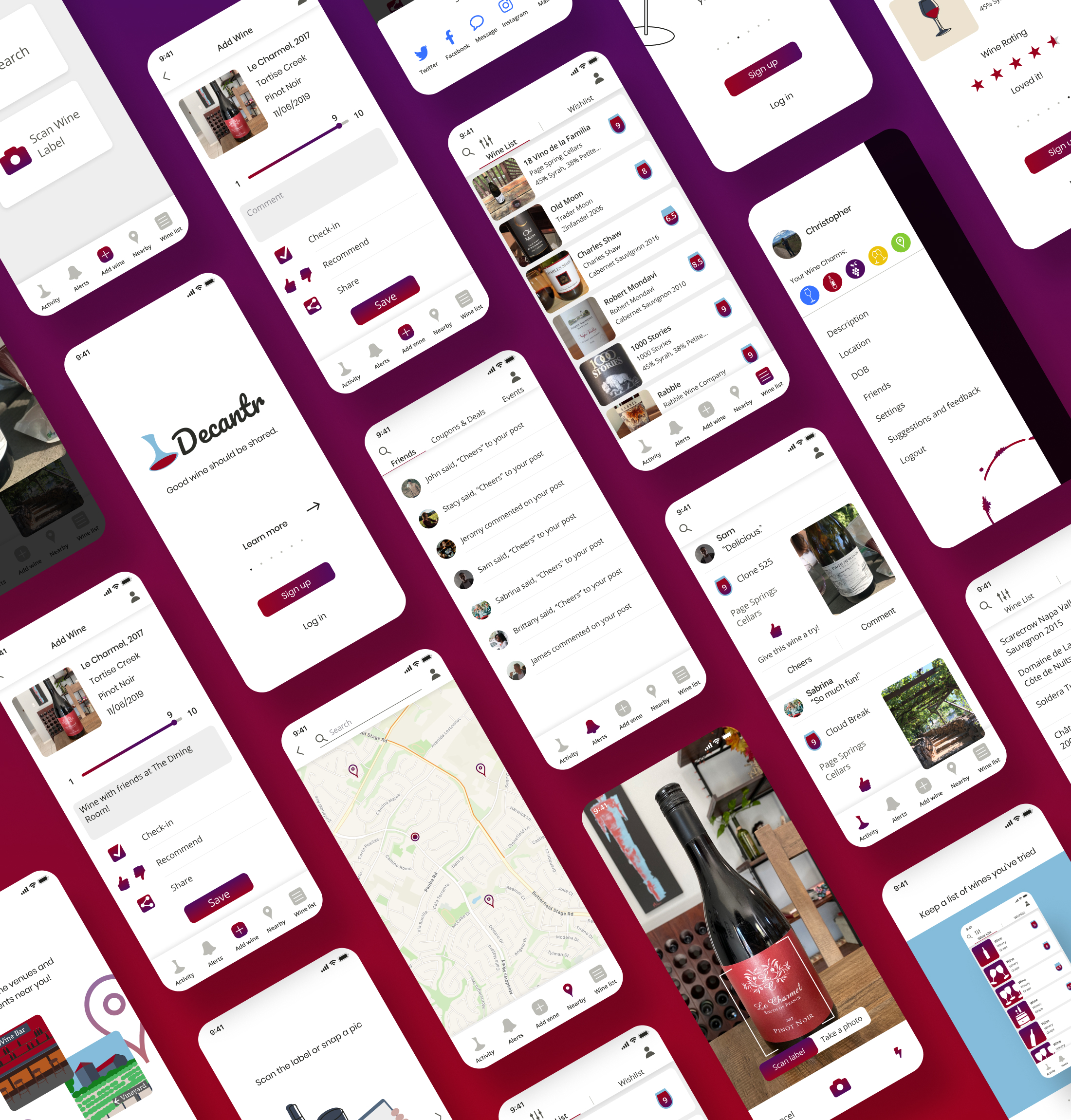
Keep a list of wines you’ve tried, rate them, and share with friends. Good wine should be shared.
Problem
Wine is something we drink to celebrate, to enjoy with friends, to relax and unwind with, and for many other occasions. With all the different grape varieties, blends, and brands, it can be difficult to decide which wine to choose and which wines you’ve tried. We spend so much time trying to figure out what wines to try but who wants to stand on the wine aisle scanning each bottle looking for the best one?
Solution
Decantr is a wine app that allows you to save a list of wines you’ve tried and sort them to see your favorites. You can recommend wines to your friends and see what wines they recommend. What better way to choose a wine than to get a recommendation from a friend! You can also easily find wine venues and vineyards nearby.
Project Roles
- Brand creator
- UX designer
- Visual designer
Deliverables
- User survey
- User personas
- User stories
- User flows
- Content strategy
- Wireframes
- Branding
- High fidelity mockups
- Prototype and testing
Tools
- Figma
- InVision
- Google Forms
- Draw.io Diagrams
The Process
User Research
User Survey
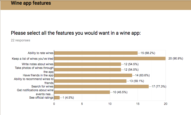
I created a user survey and shared it with potential users to try to get a feel for what features might be important to people. This is what I learned from the user survey:
People tend to drink wine at home. They mostly do not write down wines they’ve drank. The results were split evenly for buying new wines and buying favorite wines. People would be interested in seeing what wines their friends are drinking and would consider downloading a wine app even though most people do not already have a wine app. People age 31-40 were the highest demographic that replied to this survey.
The top five most important features of a wine app per survey:
- Keep a list of wines you’ve tried
- Search wines
- Ability to rate wines
- Have friends in app
- Ability to recommend wines to friends
Competitive analysis
The existing wine apps that I reviewed are Vivino, Delectable, and Untappd. I’m including Untappd in this because they have a very similar feel, besides being for beer. Vivino seems to be the better of the two wine rating apps with their easy to use app and great features. Untappd is a great social beer rating app that has features that should be included in a social wine app. I don’t like Delectable’s rating system, it starts at 5 and goes to 10. After reviewing these companies and doing a few general category searches I think the sweet spot for a new wine app is to take some features from all three apps and add more social features.

User Interviews
After reviewing the results from the survey and competitive analysis, I interviewed a few survey participants to get a more in depth idea of the target market. I used these interviews as a way to learn more about what motivates users regarding wine drinking and apps. I also asked questions about goals, frustrations, and short bios.
User Personas
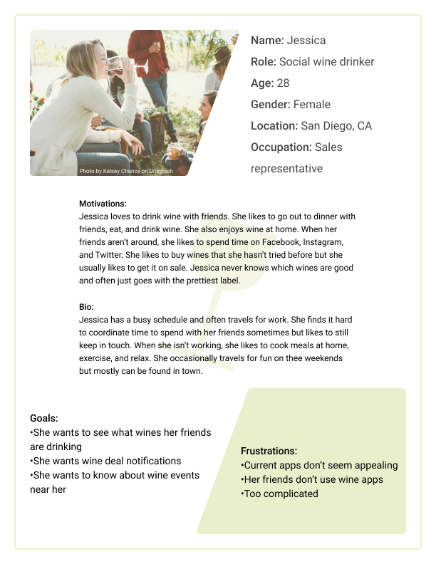
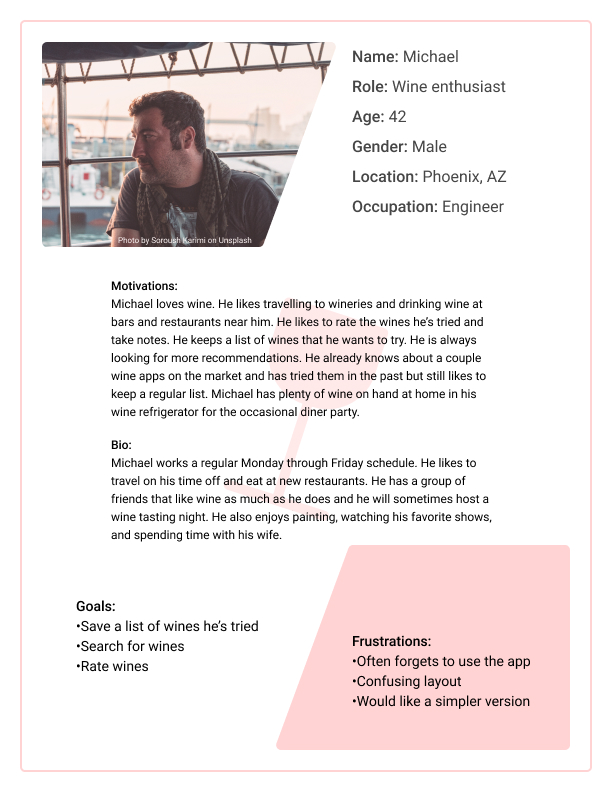
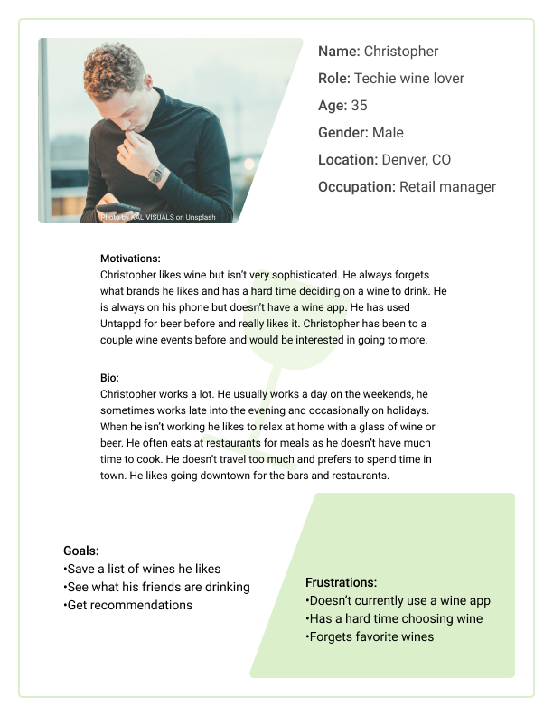
I took what I learned from the user surveys, user interviews, and competitive analysis and I created three user personas to represent the target market. These personas should help to keep the target market in mind when deciding on features and creating the brand.
User stories
Now that I had a better idea of who the target market is I created a list of the most important features that the app should include. This list will help prioritize user tasks when making the MVP. It strongly mirrors the the most important features found during the research phase of the project.
| Role | Task | Importance |
|---|---|---|
| As a returning user | I would like to view and edit my list of wines | High |
| As a returning user | I would like to search all wines | High |
| As a returning user | I would like to rate wines | High |
| As a returning user | I would like to interact with friends | High |
| As a returning user | I would like to recommend wines to friends | High |
User Flows
I took some of the most important tasks found in the user stories and created a few user flows. I made these so I could visualize what steps will be needed to create the wireframes.
Rating wine user flow

Information Architecture
Wireframes
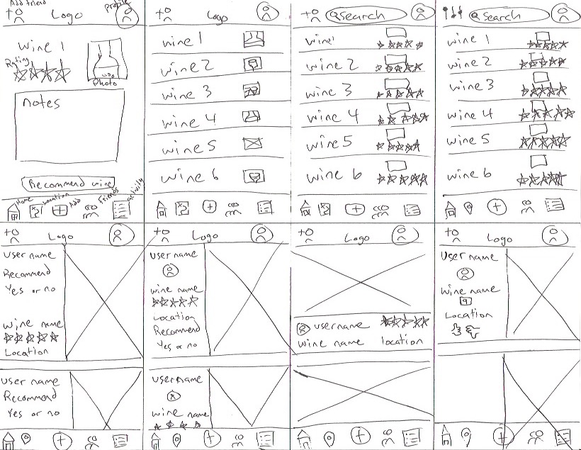
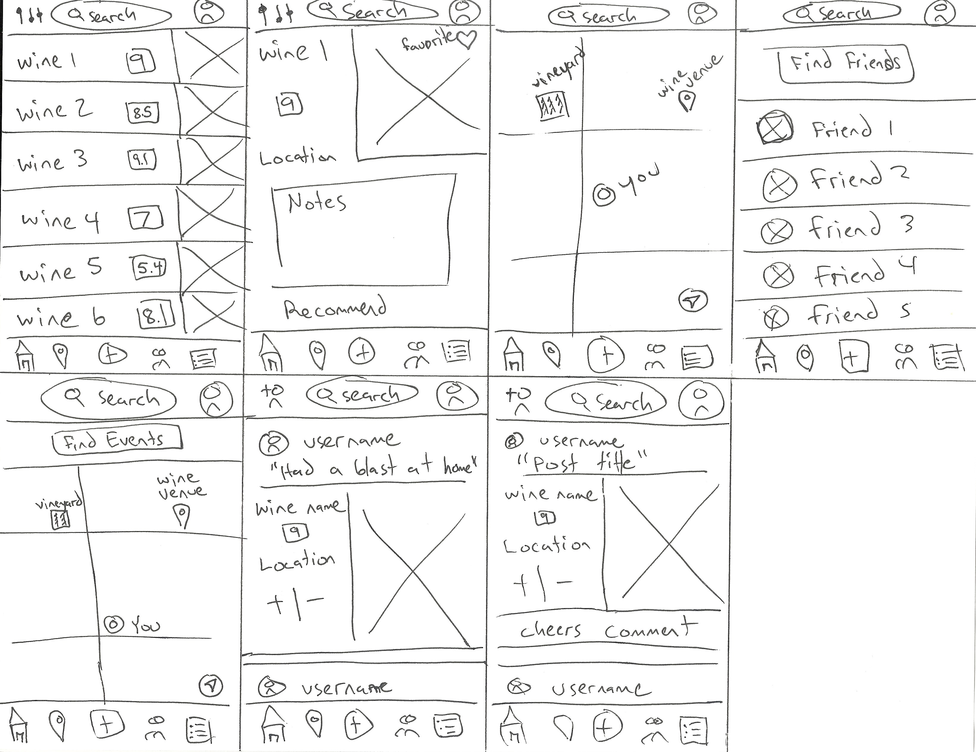
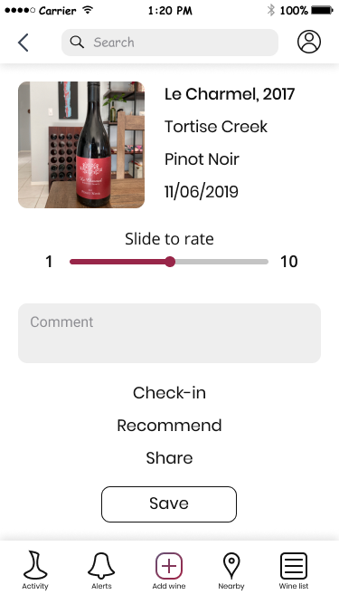
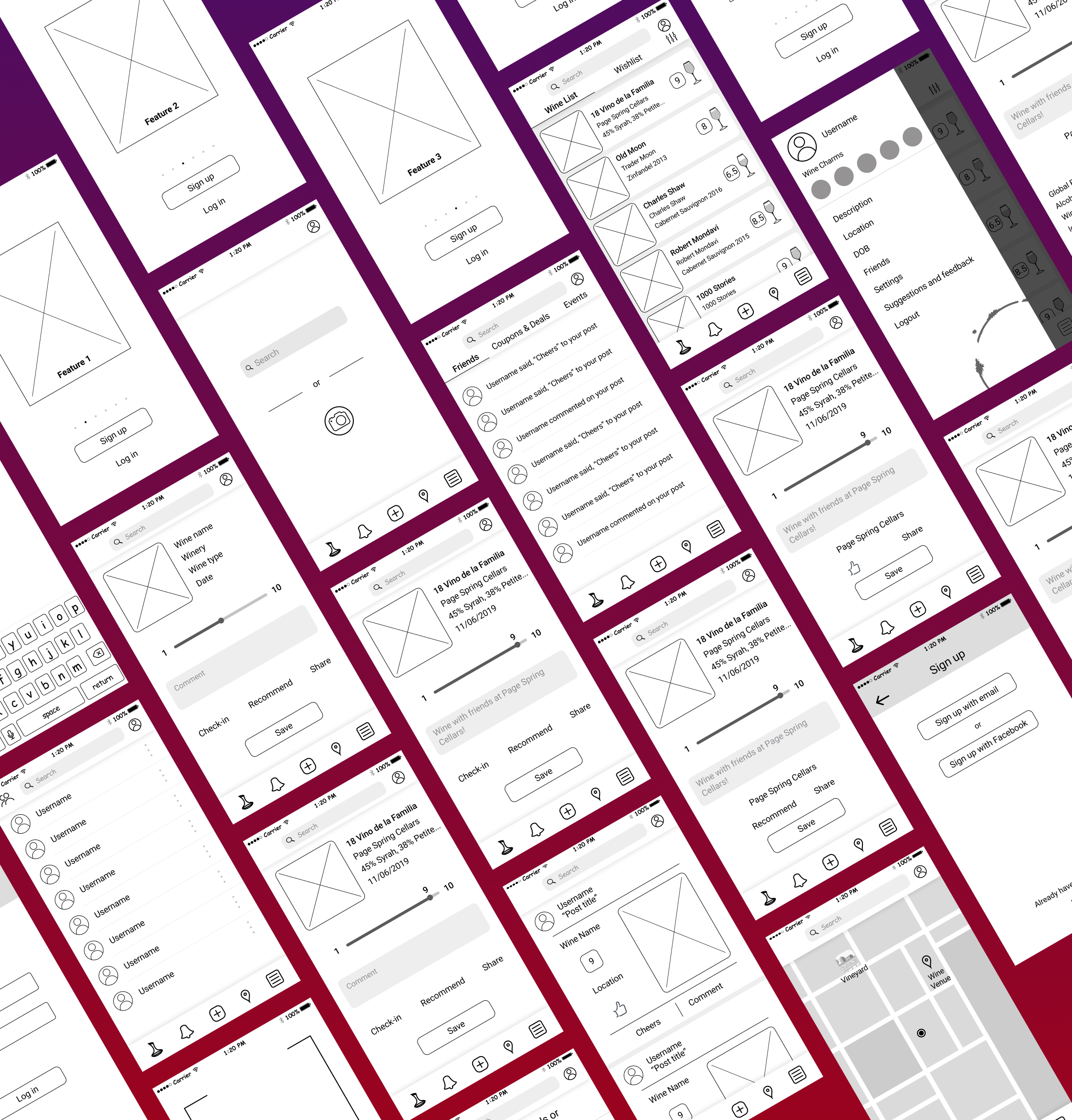
I started out with some rough sketches of how I wanted the app to look and function. I went through a few iterations before moving on to digital wireframes. I wanted this app to be minimal, easy to use, and about the user content/ interactions. I built the wireframes based on the most important features from earlier and tried to keep the design simple.
Wireframes Sketches
Wireframe Mockups
Branding
Building the Brand
Branding this product was difficult. I liked what the competition did with their branding and styles but I had to find a way to differentiate.
Name & Logo
I first created a list of words that are associated with wine. I then took my favorites and checked to see if they were taken. I narrowed it down to just a couple names and played around with some potential logos that went with the names. I ultimately decided to go with Decantr because I had some sketches of decanters that I liked. I created multiple logos using different decanter shapes and then took those logos and tried them out with different colors, sizes, and variations. I had two logos that I really liked but I ended up going with the logo that I felt would be more recognizable.
Colors
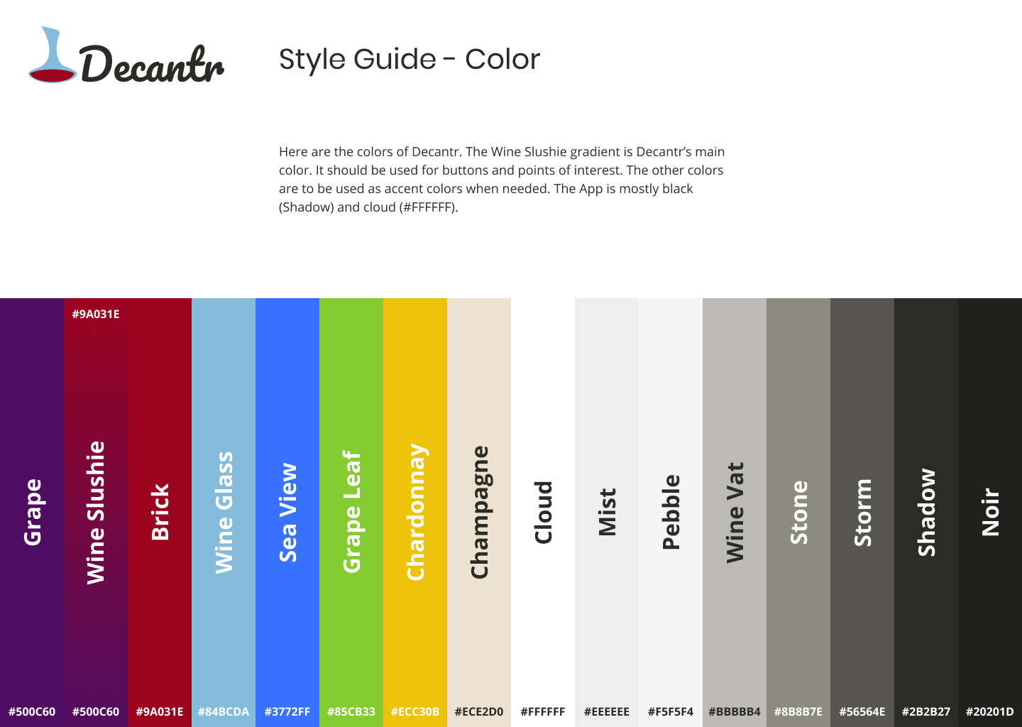
The most obvious color for a wine app is red but Vivino uses a nice red color. I also like what Delectable did with their gray and red colors. After looking at wine apps, websites, wine bottle labels, and a lot of testing color palettes on sample screens, I finally landed on a color palette that is simple and fun. I decided I would use color sparingly though, to give the app a minimal, almost Uber feel.
Typography
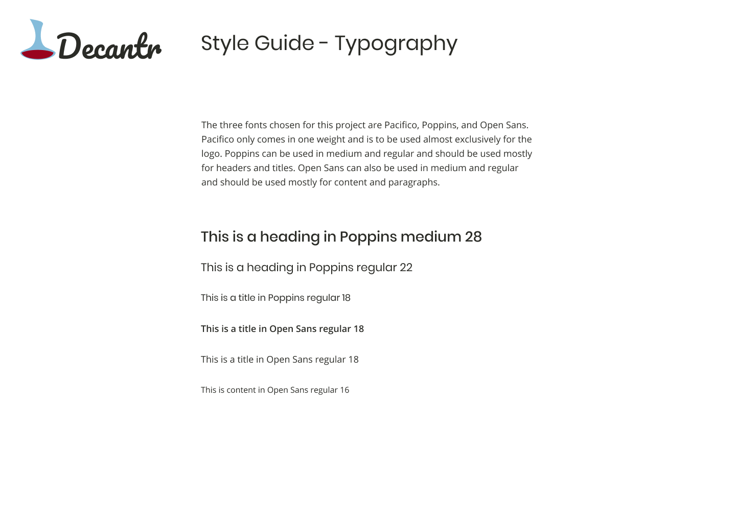
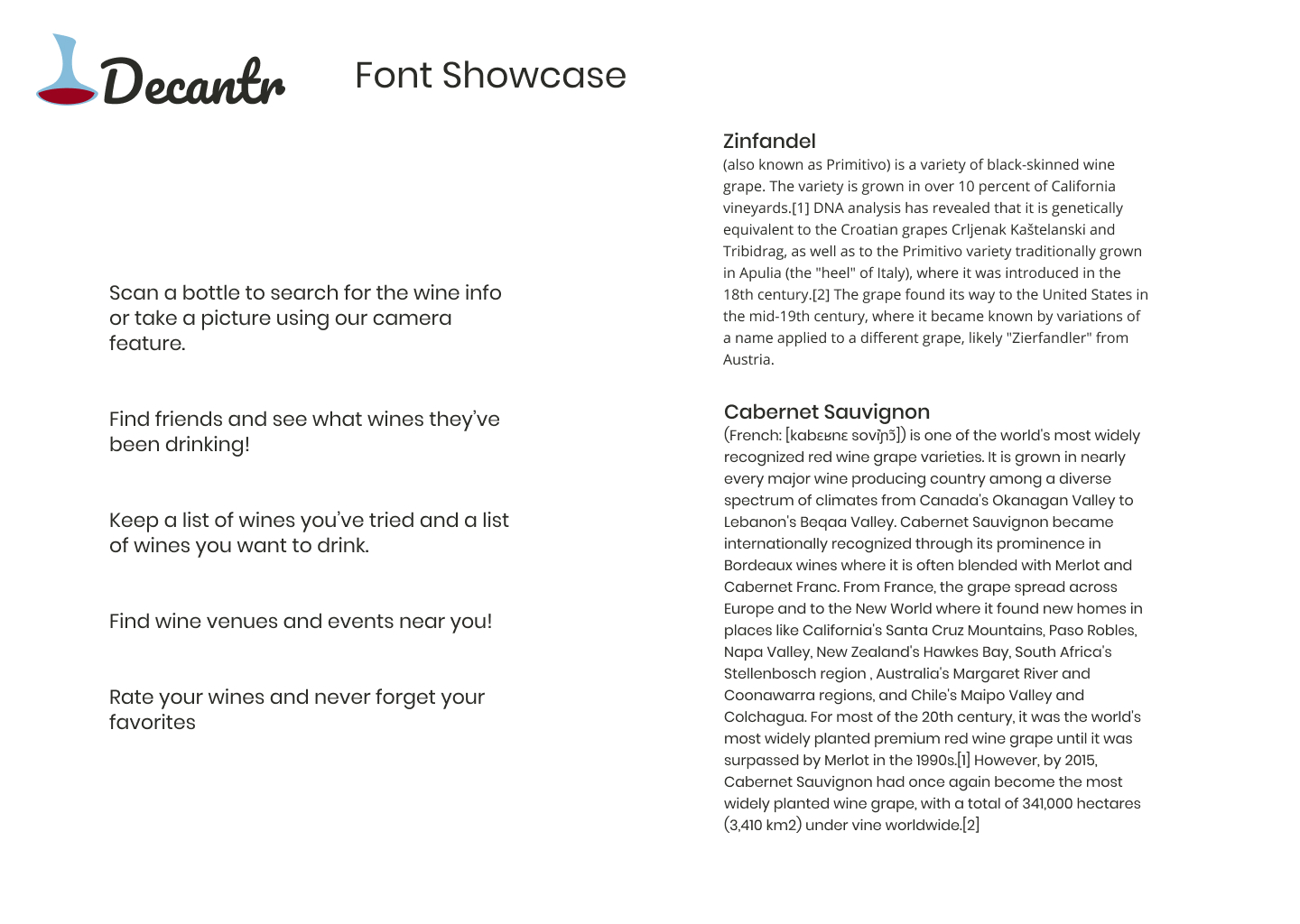
I chose Poppins to add character and interest to headers and titles. I chose Open Sans for all other text because it’s minimal, modern, and easy to read.
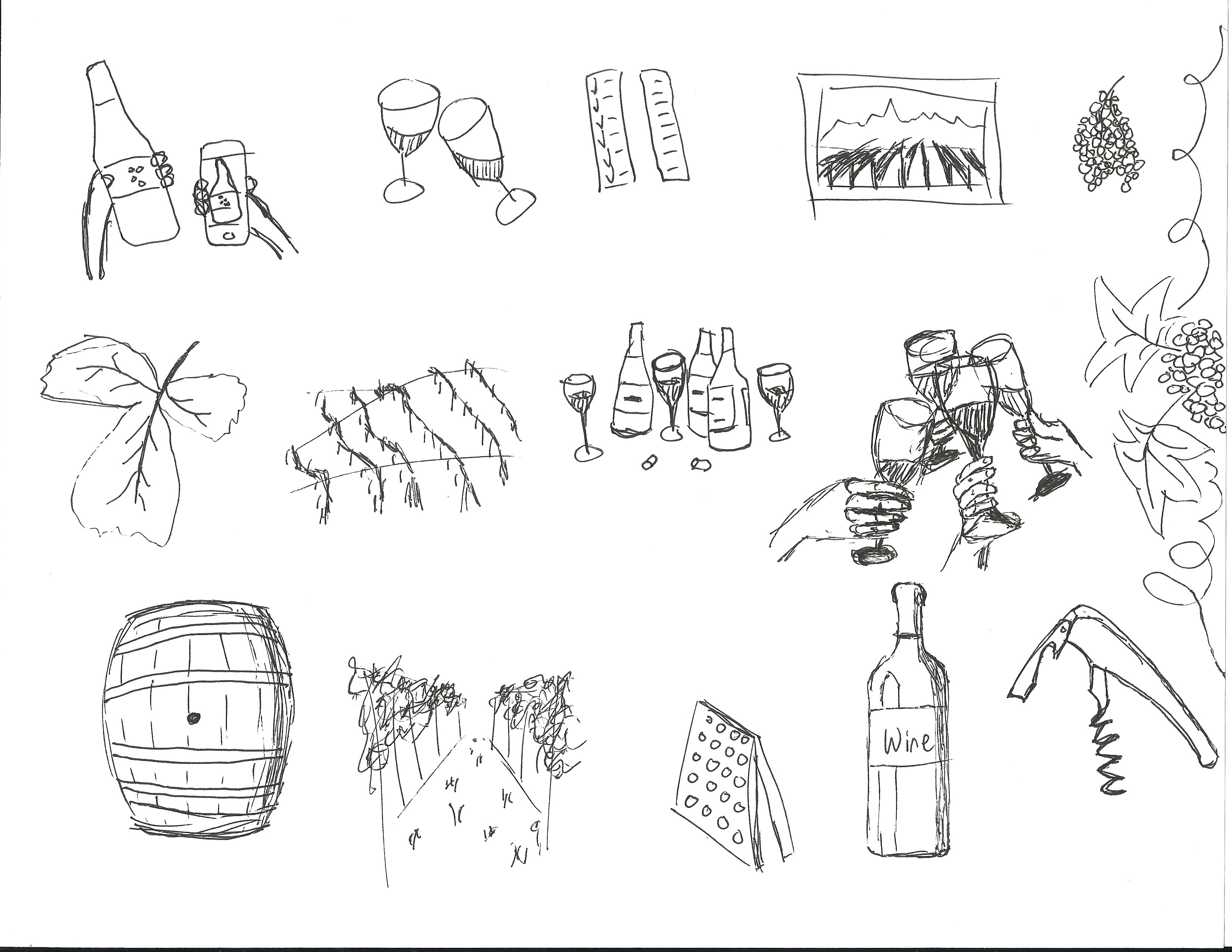
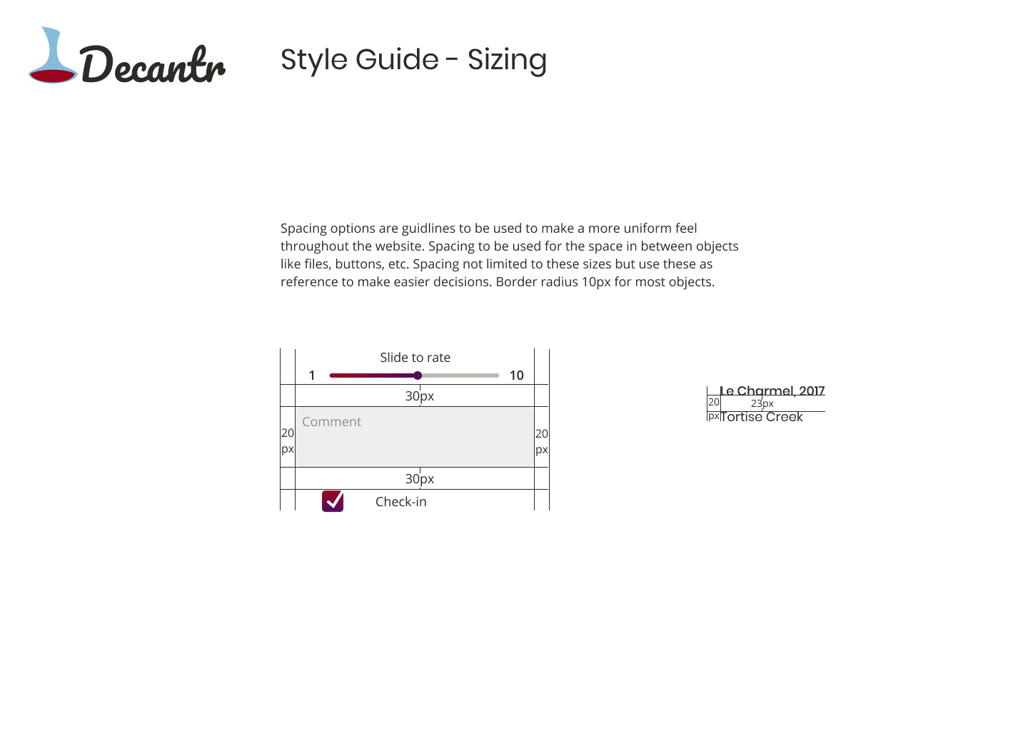
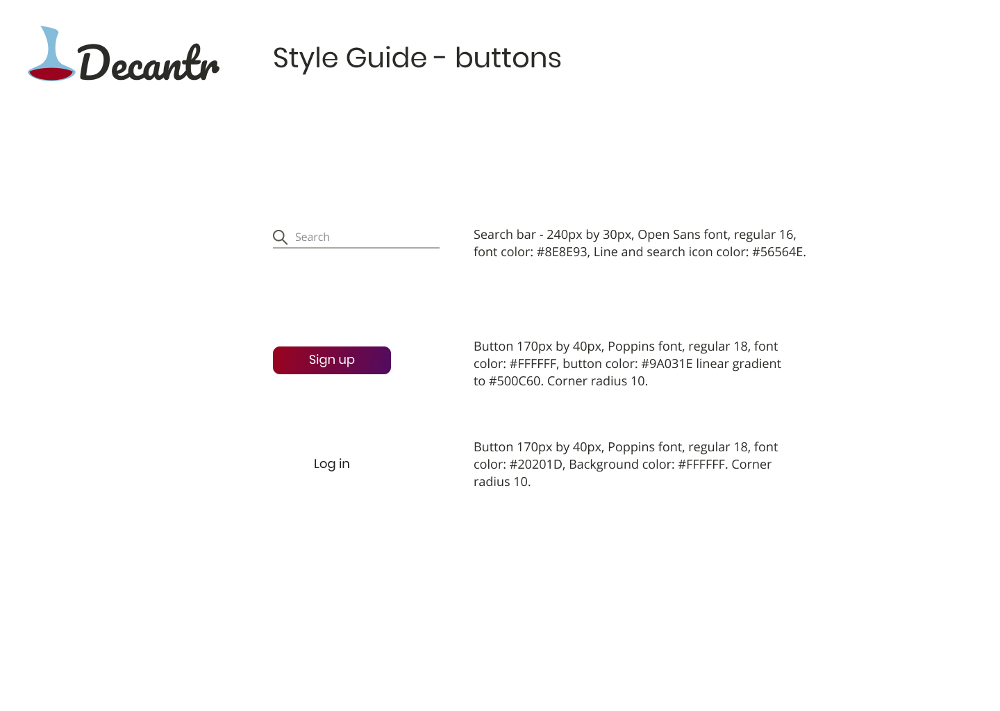
I also sketched some wine related illustrations for inspiration. Once these decisions had been made I built the Decantr style guide.
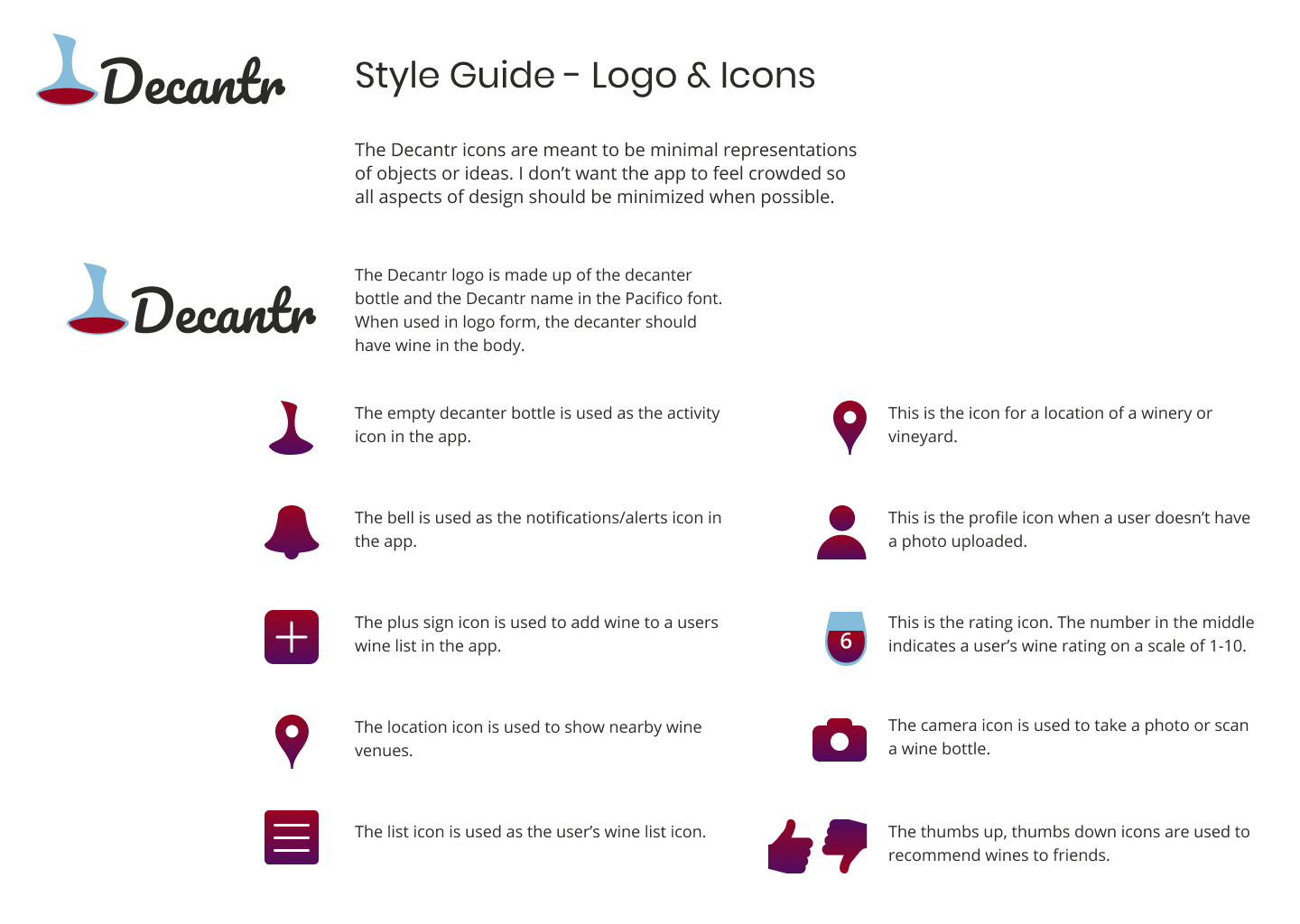
Style Guide
Visual Design
Mockups
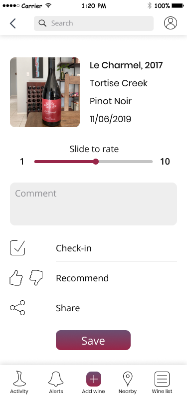
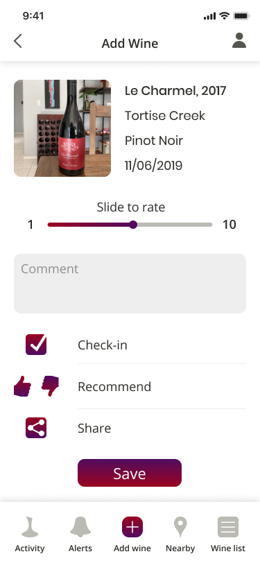
To create the mockups I took my wireframes and changed all the fonts to Poppins and Open Sans and added the colors. I tried using the colors in a few different ways . I wanted the app to be mostly black and white with the colors only used as accents. I also added mock photos of wine, users, and illustrations.
Mockup iterations
Wine Found Screen
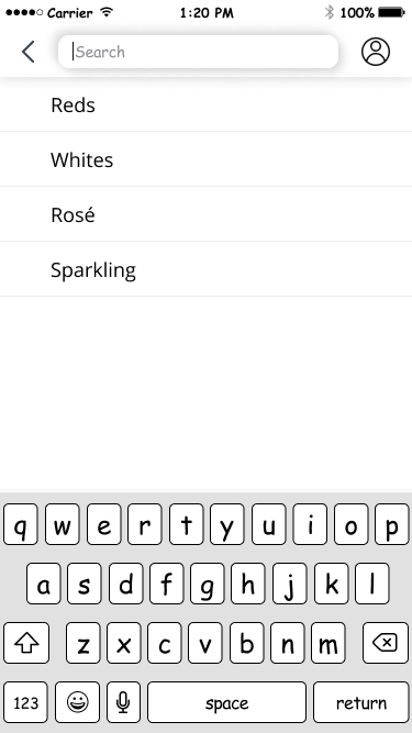
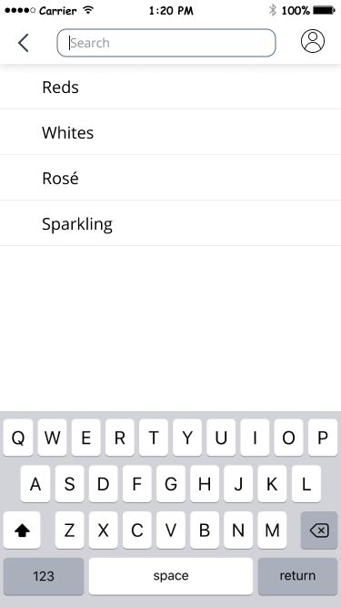
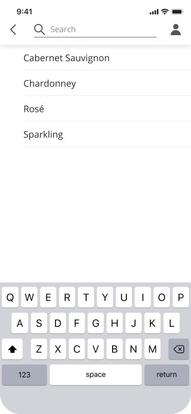
Search Screen
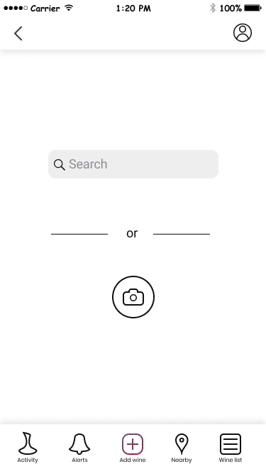
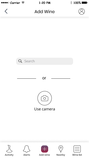
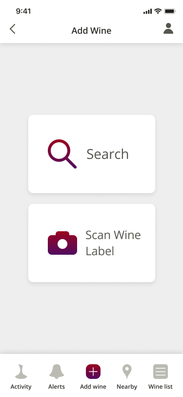
Add Wine Screen
Prototype
To build the prototype I took my mockups and put them in InVision. I added the hotspots to the screens to make them functional and did some user testing.
Usability Testing
Using the wireframe mockups, I created a clickable prototype on InVision. I conducted user tests via video chat and in person. I had the users show me how they would sign up for an account, add content to the account, and organize their content.
From the usability tests, I learned that I should include a quick user tutorial and add text to the email and password inputs for the sign up process.
Conclusion
This was a fun and challenging project. I really enjoyed making the illustrations and building the brand. I also like how the bottom navigation bar turned out.
It was challenging to include everything I wanted on some of the screens without having them feel too crowded. I eventually solved this by added some scroll to a few of the screens and moving some of the options to the profile view.
Something that I learned from this project is the importance of user testing. There is always something that the users will do that you don’t anticipate. For instance on the camera screen I didn’t know how badly users would want to tap the button to change from “scan a label” to “take a photo” so I added an extra screen to the prototype so users could change the setting.
If I had more time I would have built a more robust prototype. I would have Included more screens like one explaining the wine charms in the profile.
